 My digipack cover is an outline of the main male characters face that is used in our music video. My aim is to produce an easily recognisable front cover that will attract my target audience. This needs to be unique, inventive and bright.
I took this photo of Jack and uploaded it to use in Photoshop. I darkened jacks face and made it wider to fit across the frame of my cover. I tanned his face slightly to lose some shadows. This showed less contrast which allowed me to pick
 bigger sections to make the face black and white.
I used the magic wand tool to select sections of Jack's that I could fill to make them black.
 I decided that I wanted to use this type of contrast because it suites my target audiences needs. My target audience is both genders aged 16-24. They are interested in the clubbing scene and listen to this electropop music on a regular basis. They are familiar with this artist and what conventions the artists own digipacks use.
I continued to use the magic wand tool to select more areas of the characters face, then I began filling in the tonal areas with white to create the contrast. This is shown below in the next image.
This contrasting of my original image allowed me to begin to create a challenging artistic piece. The front cover will attract the audience as it is recognisable.
The areas of white on this are scattered form where the magic wand tool has selected the lighter tones. I wanted the lines to be bolder with less 'blending' and so i took the paintbrush tool and used it to fill around the scattered line.
 As you can s
 ee in the next (below right) makes the facial image appear more abstract. This abstract male face stands out from other digipack covers as it is bold and simple.
In the next image you can see the final image that will be used. On this is the typography that Frankmusik himself uses. It ios typical convention of his album covers and it creates an identifyable style that the audience will recognise.
The colour of this typography is a bright pink. It stands out above the plain black and white page and also adds some diversity. The typography used is a bold, san serif font which is typical for this target audience. The audience themselves have bold, outgoing personalities which means that this typography will attract them to this digipack.
The typography is not a typical font, there is overlapping of the letters which could indicate
 the overlapping of musical genres that Frankmusik belongs to. The 's' is in the style of an electrical bolt which shows the electro-pop genre. The target audience recognise this and it influences them to buy the album as they feel clever for working it out.
Below is the finished front cover of my digipack. It shows the digipack title 'Gotta Boyfriend?' I have placed this arial font, size 12, right on the right hand border. This places it a litlle further away from the image so that it stands out. Also I placed this text in white to make it stand above the black background, it is also in bold and capital lettered. The target audience recognise this font as their eyes are directed towards light areas on the page.
 The photoshop edited image takes up over two thirds of the page making it the main focus of the page. The audience sees this mysterious image and wonder who the charecter is. The target audience, both genders aged 16-24, like this as they estblish that it is a face and feel clever for doing so.
I like this cover as it is quite simple and there is not alot of information which makes it more interesting. The colours go well together and contrast well making each section a key focus on the page.
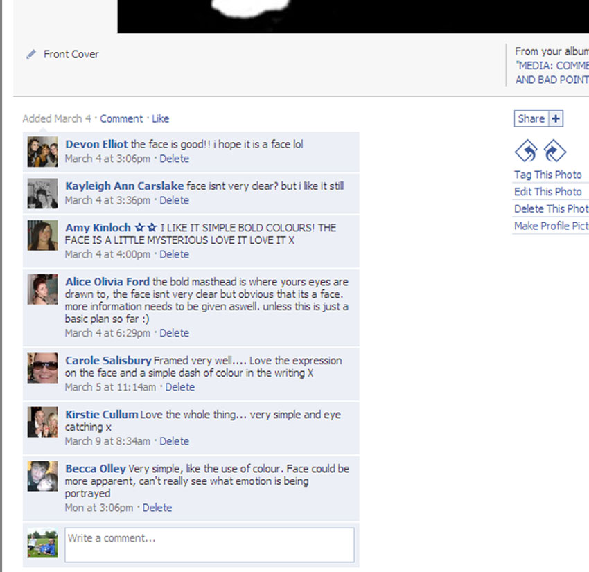
I placed the images of my digipack on my page on Facebook in order to get some feedback on my designs and see some possible improvements. I asked for feed back as well as constructive criticism in order to be able to improve the design to suit the needs of the audience. The main people that commented on my page were around the age of 18 which is in the age group of my target audience.
Most of the feedback commented on the bold colours and how they go well together and makes the piece eye catching. The audience likes the simplicity of the design and says the face looks mysterious.
Some criticisms that came from this design were that the face was not clear enough. The expression could not be established and one person was unsure whether it was a face or not. I designed this face in order to make it mysterous but i may have taken out too much which made the image unclear.
No comments:
Post a Comment