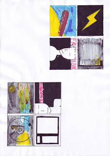
 The top flatplan that I have designed is very basic. It is a series of four images that portray elements of the genre of music that we are basing our music video on. The lightning bolt indicates the electro-pop genre with the yellow on black making the bolt stand out.
The front cover of my designed digipack is a mid-shot slight side-angled view of the main male character in the video. The target audience (males and females aged between 18 and 24) as they will recognise him from the video. This male character is looking straight down the camera as if to connect with the audience ans attract them to buy the CD/DVD.
The typeface is in shocking pink as this florescent colour is typical of the electro-pop genre. It will also stand out to the target audience as they are out-going and wear bright clothing. This also stands out on the dark background so will be easily recognisable on the shelf. the positioning of this typeface is placed behind the image of the main character. it is spread across the top third of the frame in order to be seen on a shelf.
The back casing of the digipack is of this design is an image of Brighton pier. Our music video is set in Brighton and so this establishes the scene of where the song is set. It also gives an insight into what is to be seen in the music video.
This image will be faded so that text can be seen above it. This will make the text more easily readable and not make the image the main focus.
The other image is of a darkened street in Brighton with a street light on. If there is anything in the background of this image then it will be faded and the light brightened. I can do this in Photoshop or InDesign in order to make it look professional.
Next to this image is text introducing the names of the characters within the music video and the production team involved. It is also a space where ban members can write a few notes to their audience.
My next idea also contains a series of images except this time there are just three. The digipack sticks to quite a dark colour scheme with brighter colours being portrayed to stand out to the audience. the front cover of this design is quite similar to the previous one as it sticks to the same conventions except this time the main character is facing the camera in a close-up shot of his face. He is making eye-contact with the audience again as if to connect with them.
The background is again black with a florescent pink typeface standing above it. this will again attract the target audience as they are outgoing. Below this will be a smaller, white typeface that says Gotta Boyfriend?
The back cover of this designed digipack is the initial image that we see on the video. It shows the frame of a window. Inside the window frame will contain the title of the CD/DVD and the rest of the contents of the digipack. it will also contain the bar code and copyright.
Also in the larger part of the frame there may be faded silhouettes of the main characters dancing, like in the video.
The final image spreads across both of the inner sections of the casing. It is an image taken in Brighton that shows a darkened, street-lit scene where a car i speeding past the camera. To create this line sort of image i would need to decrease the shutter speed in order to capture more of the movement of the car.
I chose this image as it sets the scene of the music video as being quite pacy, like the music, and the physical scene where the music video is based. This will be recognisable to the target audience as they live this lifestyle week-in, week-out. They are clubbers that travel to Brighton or want to travel to Brighton in order to enjoy the night-life there.
My final flatplan is similar images like the other flatplan designs. This is a variety of the two designs with slightly improved parts.
The frontcover is similar to the design of the frontcover for the second digipack, except this time the background is not black it is white. I cannot decide which is the better design as i think i will need to look at the Photoshop/InDesign outcomes before i decide. Although i do think that the darker background would fit with the conventions of the rest of the digipack, the white background would make the cover look fresher and may make it stand out more as it is a simplistic view.
the typeface would be kept the same although the white text would now need to be in black in order to stand out.
The back cover is the image of the window frame with a dark background. in this image you can see the positioning of the bar code and the listing below it in the thinner window.
The image of the pier, i have decided, will be behind the CD/DVD holder as it is not a main focus but it will identify the scene and location. it is faded with the colours enhanced to make it look more exciting.
The lamppost image is opposite this as it is a simplistic image that leaves plenty of room for text. it can also be faded in order to make the text stand out above it.

No comments:
Post a Comment