Now that we have planned our music video it is time to start filming. After the planning we made an
animatic using our
flatplans to show how the sequence fits together. We edited this in pro-cut which is a software on Apple technology that has been produced to help with filming. Here is the
animatic:
An
animatic is a series of images that are in the same sequence as the storyboard and that have been edited to fit the music that we are using. Our
animatic is quite short and does not fit to the whole length of the song. This is due to us not capturing enough images.
Our
animatic starts off with an image of a window and then cuts to an image of a different window. This then cuts to the two main characters, one male and the other female. These are quick shot reverse shots. The sequence starts off slow and then gets faster and faster. by the end of the
animatic the shots become longer as they were used to fill up space as we did not have enough images.
I edited the
animatic and it was good for me to experiment with final cut pro. I found it difficult to use as I had never used it before. This therefore took me a long time to do. The first thing that needed to be done was to upload the images onto the laptop and then put them into the correct sequence. I used the
flatplans to do this which helped as this showed the exact order that we intended for the music video.
Next I listen to the clip and paused the music at points where there was a harsh beat or the music changed. I adjusted the length of the images to fit into the space where I had paused. I continued to do this throughout the
animatic. The
beginnning but was easy to do as we had lots of shots that could be used and I also used them more than once in quick succession e.g. at the shot reverse shot sequence. This made the beginning of the
animatic more exciting and fun to watch. This changed about half way through the
animatic where the images became
limitted and I had to start cutting at longer intervals. This made it less enjoyable to watch. To improve this we could have taken more initial images or even doubled them up to make the
animatic longer and more successful.
FILMING:As the
animatic is now complete, we can start filming the sequence. It may take a few takes to get the shot perfect but this will allow us to pick from a series to get the best one.
When filming there are many things to consider including, lighting,
mise-en-scene, angles, height but also the booking of equipment. Due the time scale in which to get the filming done, it is important that the equipment is booked and the characters can all be available. This involves
alot of communication within the group and also with the other people involved. This also requires preparation and being focused on what needs to be done.
When booking the cameras we needed to ensure that we had everything to allow us to film. This includes: a tripod and the plate to attach it to the camera, checking the battery is charged and that we have a spare and a cassette.
Whilst filming we used many different camera techniques to ensure our filming was to a high standard. The first thing we did was to switch the camera focus to manual. We moved people around the frame in order to make them clearer and used the lighting from street lights and bedroom lights to frame certain features. This allowed us to highlight the main characters as the eye focuses on lighter parts of the frame. We also used the zoom feature to get the frame in the best focus as possible.
When filming we used a handheld technique to capture our shots. I particularly found this difficult. On many occasions I would take shots and they would jolt. I found it difficult to capture a successful shot and so I didn't film a lot of the video. Instead my role was to use the storyboard to organise shots and instruct people what to do and then record the information onto a shooting script. This organisation and recording of information ensured that when we captured back our footage we could locate the best shots easier.
There was not a leader in our group and we made the decisions together to allow the best time for filming. This may have been a down fall in our work as there was not a production schedule

to keep us organised and on track. This made it hard to organise our time properly and we underestimated how long it would take to do tasks. The filming took a lot longer than expected.
The weather made it difficult especially when there was snow. We had not considered the implications that could affect our filming and so when it delayed us we found it hard to get back on track. The snow was lain on the ground for about two weeks when we had scheduled to film. This meant that we were initially delayed for two weeks which set us a long way back from where we wanted to be in our filming. This was a key period in which we wanted to film a large part of our video. After the snow cleared we carried on with filming and tried to catch up on the time we had lost. This was hard to do as it was at the same time as exams and so it was hard to get everyone together at the same time.
The organising of people was also hard. People that we were filming were extremely helpful, especially the male characters. But some characters let us down and so the filming was not as consistent as we had liked. However we had to film in this period, as we had booked the cameras and so we switched some characters around. The girl at the beginning is not the same girl that is present at the end. This makes the filming inconsistent but it was something that needed to be done otherwise we would not have finished in time.
Whilst filming, as I said previously, we used a handheld technique. This was hard to do as the camera often wobbled and so more shots needed to be taken to pick the most successful. To hold the camera steady we used a variety of techniques. Whilst inside the house it was easier than outside. This was because there were often props to rest the camera on. For example whilst filming the opening sequence in the boys bedroom the bed was right where we needed to take the shot of the computer from. This meant we had to lay on the bed and rest the camera on the knees in order to get a steady shot. this was hard to do as the bed was very wobbly and this was a zooming in shot so any wobbles were extremely exaggerated. We tried to limit the use of the zoom for this reason.
Whilst filming outside of the house the camera was used by holding with both hands and pointing at the subject. It was also held against the torso for some shots to keep it as steady as possible. For over the shoulder shots the camera was held on the shoulder as a means of rest. This m
 ade
ade sure it was not too uncomfortable for the person filming.
Whilst filming we completed a few zooming shots to highlight specific features. For example, in the closing sequence when the couple are walking onto the pier the camera zooms into a close up of their hands to highlight this. We chose to do this so that the audience could clearly see what the main focus of the frame was intended to be. You can see this in the images to the left.
Whilst zooming the camera stops and starts again. This was what we intended to do however I do not think it looks very professional. The shot looks stop-start and it does not make the video continuous. There is also a slight judder which is exaggerated as the image gets larger. This does not make the shot look very controlled.

We could have done this again to make it more controlled but this was the best shot that we took over a series and so it was the most suitable to use.
We also used a slow pan from right to left to follow the characters along the path. We did this in order to make the characters the main focus of the frame. We showed that they are on a journey and by following them it established the area around them. This helped the audience see the scene that they were in and where they were going. This is shown in the images below.


Whilst inside and outside we used the white balance setting on the camera to achieve a consistency of colour and tone throughout the whole video. This made the continuity clear and ensured that the video was consistent. This also made the video seem more professional as if it was going to actually appear on a music video.

Even though we used this feature on the camera there were some shots that could have been better if there was better lighting and positioning. For example the image on the left is a screen grab of a shot in our video. It is very dark and hard to see the characters. If we had used lighting that we set up ourselves then this could possibly have highlighted the two females and followed them across the frame in order to make it clearer.
This dark shot was used to establish the time of day and was supposed to be consistent with the rest of the video. However this shot does not make the video appear consistent at all. We wanted this shot as it is a shot on our storyboard where the girls leave the house and begin their journey. However there are no other shots in the video that highlight the evening. This ruins the continuity of the video but it is something that we had to use in the video otherwise the narrative may not have been as clear.
This was the only night time filming that we did and the only time that we could get the shot of the girls leaving the house. We did not film again at night as it was hard to get everyone together in Brighton late and it was getting later and later until the sun fell and the scene was dark. Therefore we decided to just film it in the light of day and get everything together.
We tried to use a variety of shots in order to make the video as interesting as possible and make it exciting to watch. We cut from mid-shots to extreme close-ups to h
 ighlight
 objects and features. For example, the image to the right shows an extreme close up of keys to highlight that the characters are going to be driving. This is a cut from a mid-shot of the characters walking out of the room. In these two shots we establish that the characters are leaving the house and they are driving somewhere.
We also used establishing shots when we got to Brighton. We wanted to highlight the town that we were in and what the setting was like. We contrasted how the streets were busy by showing moving traffic, showed what city we were in by showing a Brighton and Hove bus and then used a moving shot of the pier to show the coastal appearance. This contrasted the natural side of the city along with the busyness in quick shots.
Whilst filming, we tried to film on the bus but were told that we were not allowed once we got on the bus. This meant that we could not show the girls journey to Brighton and so the video was not as continuous with our storyboard as we would have liked. The two establishing shots can be seen in the images below.


I think our communication was very good on set. We realised early on that some people were better at filming than others and so we used
eachothers strengths whilst on set. One
memebr of our team, Becca, did most of our filming. she was very good with the camera and had a steady hand so the shots did not look as shaky. Although we took it in turns to film, Becca did the majority of it in order to reduce the time it took. A key role for me was to organise people and ensure the people were in the correct positions. It was to also ensure that the filming suited the storyboard and followed the shots shown. This was done well until about half way through the second page of the storyboards when we realised that the shots would not be exactly the same. We found it difficult to follow the storyboard
exactly, especially when we could not shoot the shots on the bus. This meant we had a lot of filling in to do and so we decided on alternative shots to do.
We also did not get to do
the opening sequence of the music video as we had planned. We did not get the silhouettes of the characters in the house and the quick shot reverse shots of the main characters and so the video does not go exactly the same as the storyboard. however, I think the alternative shots that we took make it just as interesting as this was only a rough draft.
Before going on set we decided what we were going to accomplish on that day of filming. Most of the time this was successful but some times we did not get as much done as we had planned. We only had a rough idea of what we were going to do and so we made
a lot of the decisions on set as a team. I think that if we had been better organised and planned our filming then we would have been done a lot quicker and it would not have been as rushed as it was at the end.
One thing that we found difficult when filming outside was other people on the street. It was hard to take shots in the busy area outside the pier and people kept walking into the frame. This meant we had to take more shots in order to get an appropriate one. We tried to film most of our video away from this busy area in order to avoid this.
In my research I analysed the crazy video Confusion Girl by
Frankmusik. This uses bright colours to make the narrative seem more interesting. The producers also cut form the artist walking down the street to a girl on her phone also walking. In the end we see them meet up where they begin kissing and it is clear that the music video is of him talking about her and their journeys to
each other.
Here is a shot from
Frankmusik's video Confusion Girl. Here is a London style bus showing the

business of the city and highlighting the rushing of people. It is a high angle shot which clearly sets the scene and makes
Frankmusik the main subject of the frame. It is an establishing shot that shows the full body of
Frankmusik. There are other characters in the
frame however they are further out of the way and they are not clear. This means the eye is drawn straight to
Frankmusik 
and not to other people and features of the page. This also creates suspense as we see the artist nearly get run over by the bus. The audience like this as their lives are very exciting.
We tried to use a similar idea to this however we used this sort of clip as a means of establishing the scene. We used a clip of a Brighton bus in the same way as this to show the business of the city and to establish where the video is actually being set.

To the right is a screen grab from the same Frankmusik video. It is a mid, two-shot of the two main chracters where they meet at the end of the video. It establishes the plot and the ending to the narrative of the video and also establishes the connection between the two characters that we see throughout.
We also had a similar shot to this in our video. As the video comes to the climax at the end we see the two main characters hold hands and walk off into the distance. It is a good closing sequence as

it establishes the intention of the two journeys that we have followed throughout the video.
When the two meet at the end the audience understands the connection between them and if they had figured it out before the end then they feel happy that they had guessed the ending.
Our shot is also a mid, two- shot of the two main chracters but instead of seeing them locking eyes we see them walking off, where the camera zooms into a close-up of the two hands together.
EDITING:Once we had finished filming we had to edit the film in order to get the shots to fit the music. We had to capture back the footage from the camera on to the latop and then get the shots onto Final Cut Pro. We then watched the shots and decided which ones were best and wrote as a caption which ones we were going to use. This helped us when putting the shots into sequence as we had already established which ones were successful.
When we had put the shots selected we needed to put them into sequence. This was easier to do as we knew what shots we wanted to use. Once we had them put them into sequence we added the music and started cutting down some shots and lenghtening others. We used the razor tool to cut shots to make them fit onto the time frame. This allowed us to cut out any areas that we didn't want and keep the bits that worked well.
When editing I found that it was quite time consuming to get everything in time with the beats of the music. It was hard to cut everything perfectly to the music and I had to keep going back through the shots to make sure it was perfectly in time. I found editing quite fun to do, it was interesting to learn how a video was made and then it was good to see the result of the editing when watching the sequence through.

Some shots that we took we decided to speed them up by double the speed or half the speed. This made the video more exciting and added to the pace. When the song got faster we sped up some shots and when the music slowed down we slowed the shot down.
To the left is an example of where we have doubled the speed of the car moving. It starts when the boys get to the car and ends when the car turns right at the end of the road. We used this particular increase in speed as the shot was quite long. It was an important shot for the video as it establishes the type of car the characters drive and also fits the sequence of them leaving the bedroom and then out of the house.
When editing we realised that we had not taken as many shots as what we should have. By the end of the video we began using longer shots as we were running out of shots to use. One thing that we could have done to improve this was to repeat shots in quick succession, to the beat of the music, to take up some time and make the video more exciting.
Timings and Shots In The Video
1 second: the video begins with an establishing shot of a house in Brighton. This is in fact a still image that I took for the animatic.
2 seconds: there is a zooming in to the window for a period of about 4-5 seconds. This is to establish where the opening sequence is set before we see the charecters. This was done in Final Cut Pro and when we edited this zooming in shot we made it last for the opening beats of the song. These beats gradually get faster and faster. As the beat changes and the lyrics come in we cut to the shot of the boys in the room.
6 seconds: here is a pan shot from right to left inside the room. The pan establishes the props used in the bedroom which include posters on the wall, beer bottles, TV, video games and lots of clutter. This shot is quites dark and we could have possibly used some lighting to make this brighter and to highlight some features, such as the beer bottles. This shot was filmed using a tripod. We had to ensure that the camera was secured properly onto the tripod and was level. To do this we screwed in the camera at the bottom and then adjusted the positioning. This allowed us to adjust the height of the shot to do some low angle and high angle shots. Using the tripod made the shots steady but when we were panning round there were some jolts and so it was important to practise.
7 seconds: repetitive movements of the chrecters where the shots are reversed. This makes the video more interesting and fits in with the lyrics and the beat of the song. The shots are sped up to double and then reveresed to repeat it again.
10 seconds: a zoom into the alcohol and then at 12 seconds the shot zooms out of the alcohol and then cuts to the girls sitting on the bed on the laptop and straightening hair. This establishes the scene with the girls and the use of props represents how the female audience are. In the background there is make-up, a girl straightening the main characters hair and a mirror. The female audience recognise this and relate it to their own bedrooms and realise they are similar.

16 seconds: this is a mid-shot of the main male character, Jack, on the computer. The camera then zooms into the computer to a close-up shot of the computer screen. This was a handheld shot where Becca laid on the bed and rested the camera on her knees. The zoom is quite fast and there is a slight jolt but its not too bad.
24 seconds: this is a shot of the girls leaving the house. The shot is extremely dark due to the time of day which is not cohesive with the rest of the video. This is poor continuity.
37 seconds: this is a cut from a mid-shot of the boys walking out

of the bedroom to an extreme close-up of Jack picking up the keys. This highlights the keys and how they are travelling on their journey. It also creates an alternative to the rest of the shots that are mainly midshots.
44 seconds: this is the double speed of the boys getting into the car and driving to the end of the road. A pan shot follows them and then stops as they turn right at the end of the road.
58 seconds: this is a girls point of view of the boys driving past. It shows that they are interested in what the boys are doing and shows a connection.
1 min, 1 sec: a shot reverse shot of the boys looking at the girls. Shows that they are also interested in the girls.
1 min, 35 sec: the car drives up and parks on the side of the road. The boys get out of the car and then at one and half times the speed this is repeated and then reversed. This goes well with the beat of the song as it has been cut this way.
1 min, 47 sec: on the camera we initially forgot to turn the white balance to outdoor and so the image is really white. This makes the image less clear but I think it makes the video more interesting. It adds another dimension and makes it seem as if the boys have had too much to drink.
1 min, 51 sec: this is a combination of two establishing shots that tells the audience that the video is set in Brighton. The pier and the bus both shows that the scenes are from the coastal region and he busy city of Brighton.
2 min, 3 sec: this is where the music slows down and then we slowed down the shot to make it suite the pace of the music. It is slowed down to about half speed which fits to the speed of the drums in the song.
2 min 30 sec: the charecters join at the pier and there is some flirting and messing around. These are quite long shots which i think take up too much time. There are reverse point of view shots from one of the female characters and one of the male characters to get different perspectives and angles of the scene. There are two close up shots of two of the male charecters faces with them smiling and looking cheeky.
2min 56 sec: the speed is again reduced to about half speed when the two main charecters walk hand in hand onto the pier. This fits witht he closing speed of the song as the pace slows. There is then a zoom in to a close - up shot of the two characters hands holding and then the scene ends. This zoom in begins, then stops and then starts again making it look quite bad but I think that the idea is still effective.
 Below is the original image that I took of the pier as the sun was setting. The original image shows the contrast between light and dark well. the beach in the forground is very dark, contrasting against the light background. The water and the pier in the midground also contrast against eachother.
 here.
here. aking it larger. There is less of the beach in the frame which makes it less of a focus point.
 our convention shown throughout makes the digipack consistent and shows the audience how consistent the digipack contents is.
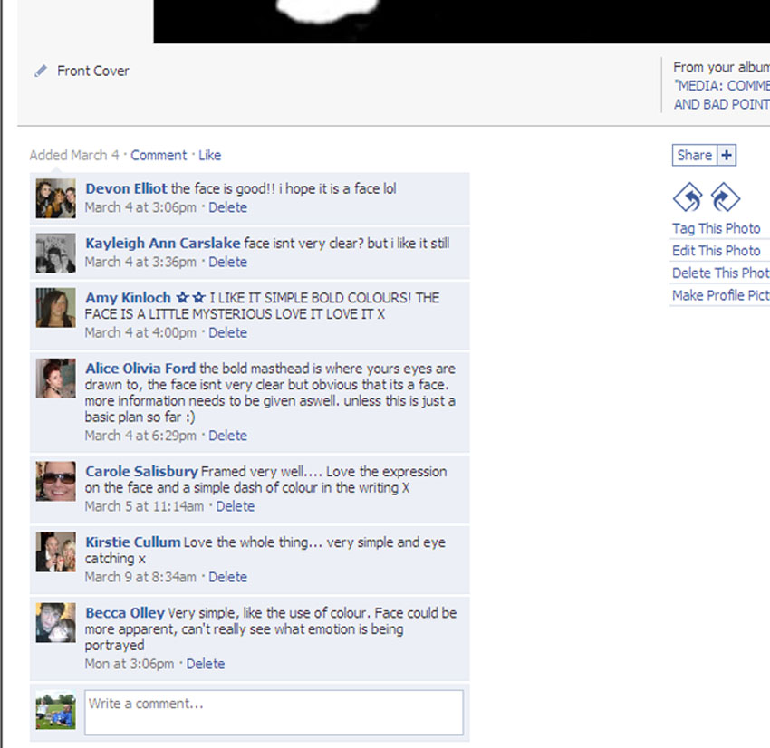
 To the right is Facebook feedback from my design of the inner left panel. One thing I recognised for this panel was that there was alot of feedback, this could suggest to me that it was really bad and there are lots of things to improve or that it is really good and lots of people like it.
 ened the audience as i have comments on this photo from 2 fourty year old women. This however does not suggest that they will like the music but they may buy the digipack to see now that they are inspired by the design.
 ened the audience as i have comments on this photo from 2 fourty year old women. This however does not suggest that they will like the music but they may buy the digipack to see now that they are inspired by the design.