The genre of music that Frankmusik follows is powerpop, electronica and dance. Other artists of these genres include Lady Gaga, Calvin Harris and Daid Guetta.
In oder to complete my own digipak I have decided to look at various artists from the same genre to see if there are similar conventions that I can stick to in order to appeal to the target audience. Therefore the first artist that I have decided to look at is Frankmusik. I wanted to analyse this artist as he is the artist that produced this song and so the target audience will be the same.
The first thing to notice on this CD cover is the artist standing naked
 . This is very controversial as it is quite exposing. It shows the artist wearing nothing but large, DJ style headphones. His pose is quite quizzical as if to say, 'what are you looking at?' It makes the image seem more normal as the character feels that this is typical behaviour. The target audience, males and females aged between 18 and 24, find this amusing as they have the same sense of humour. This attracts people to buy the album.
The title of the album is Rehab, this suites the nature of the cover as this male does not seem on the same wavelength as the rest of society. This title and the aspect of the headphones could suggest that he only has music in rehab or it rehabilitates him. Although it could suggest that he has an addiction towards music.
The other convention of this cover is the typeface. This is the same typography that Frankmusik uses across all of his CD's and albums making it recognisable to audience members. It is also in a bright yellow. This stands out above the dark, dull brown in the background. This attracts the target audience as they recognise it on the shelf, they are also used to this colour as they wear bright clothing themselves as a follower of this music genre.
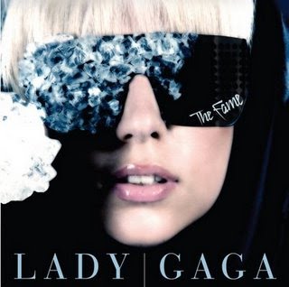 The next album cover that I am going to look at is The Fame by Lady Gaga.
This is a close-up shot of the artists face on a black background. This makes it stand out as light colours are used. Her make-up is very soft so that it doesn't make the artist the main focus. Instead we are initially drawn to the diamonds reflecting in her black glasses. This is suggesting that The Fame, portrayed by the album title, can buy you whatever you want. The glasses also cover up the artists life. As if maybe she is hiding behind the fame that she has adapted. By knowing the artists style we know that she is always in dress, she never portrays her true identity. Maybe this makes her more appealing to this target audience because they are mysterious themselves.
This front cover looks quite simplistic to produce as there is not alot going on but it is still powerful because it doesnt reveal alot about the character or the album itself. The contrast of light and dark tones on the face make the album cover strong. The white puffy-like ball image is placed right next to an area of deep black. The eye is therefore drawn o this area of light tone as it is the most obvious part of the frame.
The typography used on this album cover is not as bright as the one on Frankmusik's album cover. It is quite subtle in comparison and this suggests that it is not a main aspect. The designers have done this in a clever way, as if the album title 'The Fame' is a label for the glasses. 'The Fame' is an expensive brand.
I like the idea of using the main character of the music video as a large face to use on the front cover. I think this will draw the audience in as they feel a connection to the person. The idea of using a close-up shot of the artists face draws the audience as they feel the artist looking at them, eye contact is particularly important.
By comparing these two album covers, I have noticed that there are different styles to attract different audiences. Lady Gaga primarily targets women and so she does not need to look provocative to attract males. She produces dance music, like Frankmusik, however she desguises her appearance making her more mysterious. In contrast, Frankmusik is very open in his appearance. This is shown by the nudity shown on his album cover. This shows the diversity that is apparent within musical genres.